The Dog Poem; CSS and Carp Design
Intro;
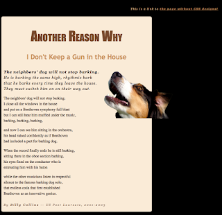
This week in e9 we learned how to make a website on Adobe DreamWeaver using step by step instructions given to us by the teacher. We read the instructions and created the website. This is the second website we have made using Adobe DreamWeaver, our first being our first semester final. Overall, the project went fairly well, even though there were a few bumps along the way. The focus of the project was to learn CSS and work on CARP (Contrast, Alignment, Repetition, Proximity) to make an already set up website look appealing. There were many many obvious major differences between the two websites including color being added, fonts being added/changed, and adding organization and alignment to the page. On DreamWeaver, you can edit everything pretty simply by changing the selectors under the CSS Designer tab.
 |
| After |
 |
| Before |
CARP
Contrast:
We used a contrast in colors by eyedropping colors from the dog, and using those colors for the font, background and border. I personally thought that that was a great idea. We also used a contrast in sizing and fonts by making the title bold and made it a different size and color from the body.
The title was Center Aligned while the stanza's were left aligned, which I remember from Graphic Design apparently looked more aesthetically pleasing than having the main paragraphs center aligned. The dog picture kind of bugs me because it goes off the page, but I didn't know how to change its position so I just kept it where it was.
There was barely any repetition on this page. The colors all all different and there is a variety of fonts and spacing. The only thing that was repetitive was the body paragraphs, but it would have been weird if they weren't all the same.
Alignment:
The title was Center Aligned while the stanza's were left aligned, which I remember from Graphic Design apparently looked more aesthetically pleasing than having the main paragraphs center aligned. The dog picture kind of bugs me because it goes off the page, but I didn't know how to change its position so I just kept it where it was.
Repetition:
There was barely any repetition on this page. The colors all all different and there is a variety of fonts and spacing. The only thing that was repetitive was the body paragraphs, but it would have been weird if they weren't all the same.
Proximity:
If I'm being completely honest, I don't 100% remember what proximity meant, but I looked at my other page and all of the paragraphs on my website were properly spaced, everything was grouped correctly and evenly, and it was all lined up on the page except for the link. We don't talk about that.
Comments
Post a Comment